MORE FROM KIPS BAY: DETAIL DRIVEN
Charles Eames famously stated, "the details are not the details, they make the product." Many designers used decorative painting as a way to add panache. Graphic geometrics, faux finishing and stripes can have a tromp l'oeil effect, making a big space seem smaller and a small space seem bigger. Painting can be an economical alternative to a rug and creates visual interest.

An M.C. Echer- like floor in McMillan room entrance look like they recede, and a pattern like this probably was inspired by Florentine marble inlay floors of the Renaissance.

Concentric squares in black and white is bold and fun, and makes this small space lively.

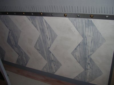
Natasha Bergreen and Liza Cousins created a chair rail out of tape trim, varied nail heads and painted lines. Faux bois Zig-zag stripes on the lower part of the wall draw the eye up, and the finishing touch is a small grey line at the base of the wall where it meets the floor, creating insta- molding.
 Grey stars on the field of a sisal rug provide a distinctly American charm. Zing up a natural material with a painted stencil to get a country feel.
The Stencil Library in London has the best designs.

Garrow Kedigian created simulated molding with pinstripe painting. Very clever.
OTHER DETAILS OF NOTE:
 Charlotte Moss had a velvet pillow embroidered with pretty scrolls and flourishes.

Juan Montoya placed tiny porcelain flower-filled cache pots all in a row. Set on an architectural giltwood console, it is an elegant, symmetrical statement. A vignette like this is so simple, yet it oozes charm.

An M.C. Echer- like floor in McMillan room entrance look like they recede, and a pattern like this probably was inspired by Florentine marble inlay floors of the Renaissance.

Concentric squares in black and white is bold and fun, and makes this small space lively.

Natasha Bergreen and Liza Cousins created a chair rail out of tape trim, varied nail heads and painted lines. Faux bois Zig-zag stripes on the lower part of the wall draw the eye up, and the finishing touch is a small grey line at the base of the wall where it meets the floor, creating insta- molding.
 Grey stars on the field of a sisal rug provide a distinctly American charm. Zing up a natural material with a painted stencil to get a country feel.
The Stencil Library in London has the best designs.

Garrow Kedigian created simulated molding with pinstripe painting. Very clever.
OTHER DETAILS OF NOTE:
 Charlotte Moss had a velvet pillow embroidered with pretty scrolls and flourishes.

Juan Montoya placed tiny porcelain flower-filled cache pots all in a row. Set on an architectural giltwood console, it is an elegant, symmetrical statement. A vignette like this is so simple, yet it oozes charm.