KAPITO MULLER DESIGN A MODEL NEW YORK APARTMENT WITH COOL ELEGANCE
Photos by Nick Johnson courtesy of Domino
One of my favorite designer duos to watch, Kapito Muller, was asked by Domino Magazine and developer HFZ Capital Group to design a four bedroom model unit apartment in the Chatsworth, a storied historic residential building on New York's Upper West Side. I wonder if this will encourage more developers to enlist interior design talent to entice sales, with all the new towers sprouting up across the manhattan skyline. The result is a sophisticated, art-filled dynamic home, with a neutral palette, interesting combinations and beautiful details. They mixed furniture and accessories across a wide variety of price points, showing its how a space is put together that matters. I sat down with the designers, Alyssa Kapito and Vivian Muller, who met while working for Bunny Williams, to discuss the project.
Who was your dream client you designed for?
We were designing the space for young family on the upper West side. A family that entertains, for both children and adults, so the space needed to be sophisticated enough for evening parties and practical enough for children.
Why did you decide to go neutral?
We were really trying to create a space that would appeal to a large audience, nothing too stylized or too funky. But a lot of our spaces are neutral, we find neutrals to be really easy to live with.
How do you design a neutral space with visual interest?
To give the space character we mixed a lot of texture: Linens with velvets, embroidery, lacquer, and wovens etc. We also mixed metals to give an added layer of interest.
How do you design a space that will have a wide appeal to potential buyers? What did you keep in mind?
We knew we were designing a space that was going to be mostly neutrals so in order to add interest we used a lot of layers. We started with the base of ivory and tans and added little "color" with coffee-table books, metal finishes, pottery, trinket boxes and bowls, just things that bring the little life to a neutral palette without overwhelming it.
They created a focal point in the living room by using six framed black and white pieces of art that filled the wall. Focusing on interesting shapes, the seating area, done in a neutral palette with pops of black, includes a mix of modern glass, metal and mid century pieces.
In one of my favorite spots in the space, Kapito Muller used a gold framed round convex mirror from Restoration Hardware and an Arteriors cerused wood console alongside other well-placed objects that stand out for their pretty shapes
Light and airy, the dining room features a glass topped table and light woven Swedish chairs for a crisp look
The all white and marble kitchen is infused with some hip Workstead light fixtures and aged metal stools
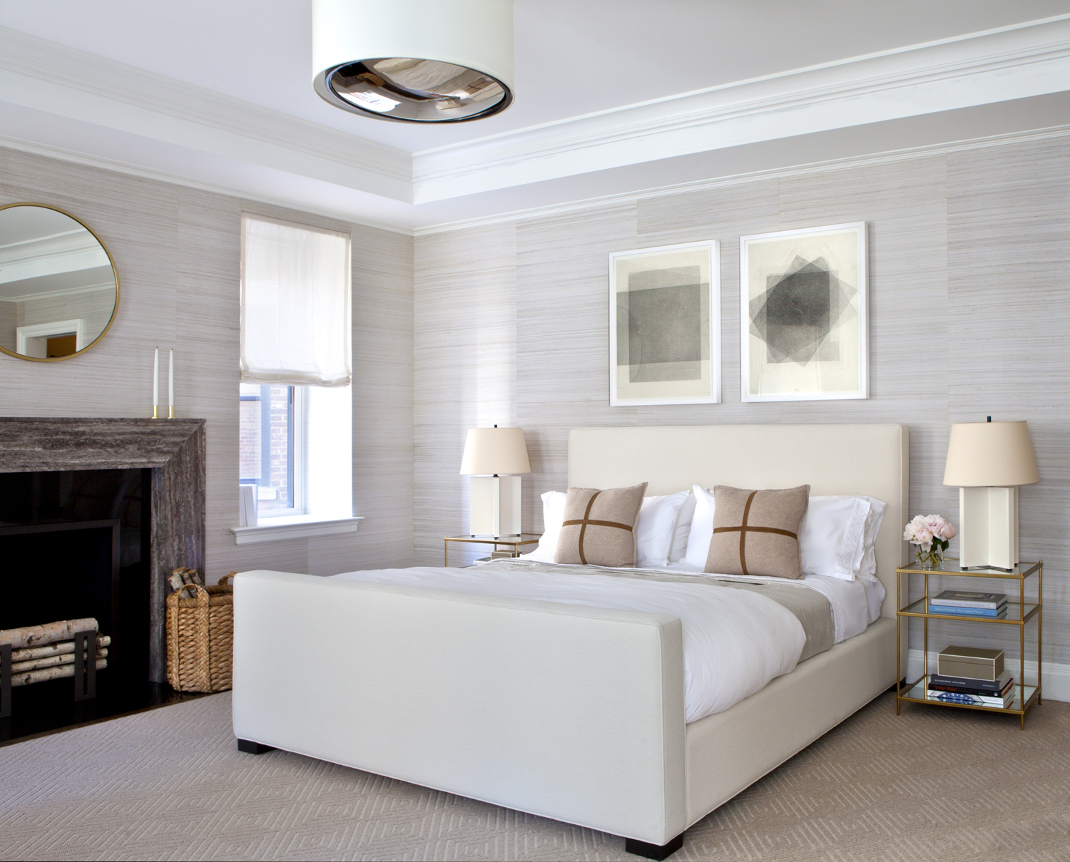
A custom cream upholstered Avery Boardman bed sets the serene tone in the master bedroom, where a bit of gold and textured walls keep things sophisticated
A dose of red and blue jazz up this guest bedroom space with a daybed. Bringing in white rectangular ceramic stools and a playful wicker chair inject a sense of fun.
In another bedroom, things feel fresh and tailored. A modern desk and fantastic French woven rope chair offset the colorful patterned rug and wavy art print on the wall.


