A FIRST LOOK: THE 2016 KIPS BAY DECORATOR SHOWHOUSE
21 of interior designs top talents transformed this year's Kips Bay Decorator Showhouse townhouse at 21 East 61st Street into a dazzling place where endless inspiration, craftsmanship, and creativity are on display. Celebrating 44 years, the designer lineup and the rooms they created this spring is truly stellar. Design observations I made tended to focus on what I didn't see rather than what I did. This showhouse, any showhouse, is an opportunity to think big, go big (with no client considerations to worry about), and this year designers provided a high level of excellence. It was the year of the custom finish and bold swaths of color, where walls and floor surfaces were treated with care- from scenic hand painted wallpapers, lacquer, terrazzo, marble, and an extremely high level of detail (and cost). It was also the year of the non-print. There were very few floral prints, and upholstery tended to be done in solid fabrics with walls that were treated in a special manner. There were large scale pieces in small rooms, a tricky feat. Here is a look at some of the spaces that set the tone this year; more to come.
Photos courtesy of Philip Ennis
Designer Alex Papacristidis created a beautiful dining room filled with over the top antiques and silver and gold accents. A scenic hand painted Gracie Wallpaper enveloped the room with a narrative.
A long sofa and plenty of seating for post-dinner party conversation. Glittering metallics and lush upholstery made this a jewel box of a room, even though it was large.
The entry hall, created by the British firm David Collins Studio, referenced one of their most iconic projects done 16 years ago, The Blue Bar at The Berkeley Hotel in London. It added the right amount of glamour and drama as the first thing visitors see when they enter the house.
It just so happened that an Albrizzi desk from Liz O'brien matched the color scheme perfectly
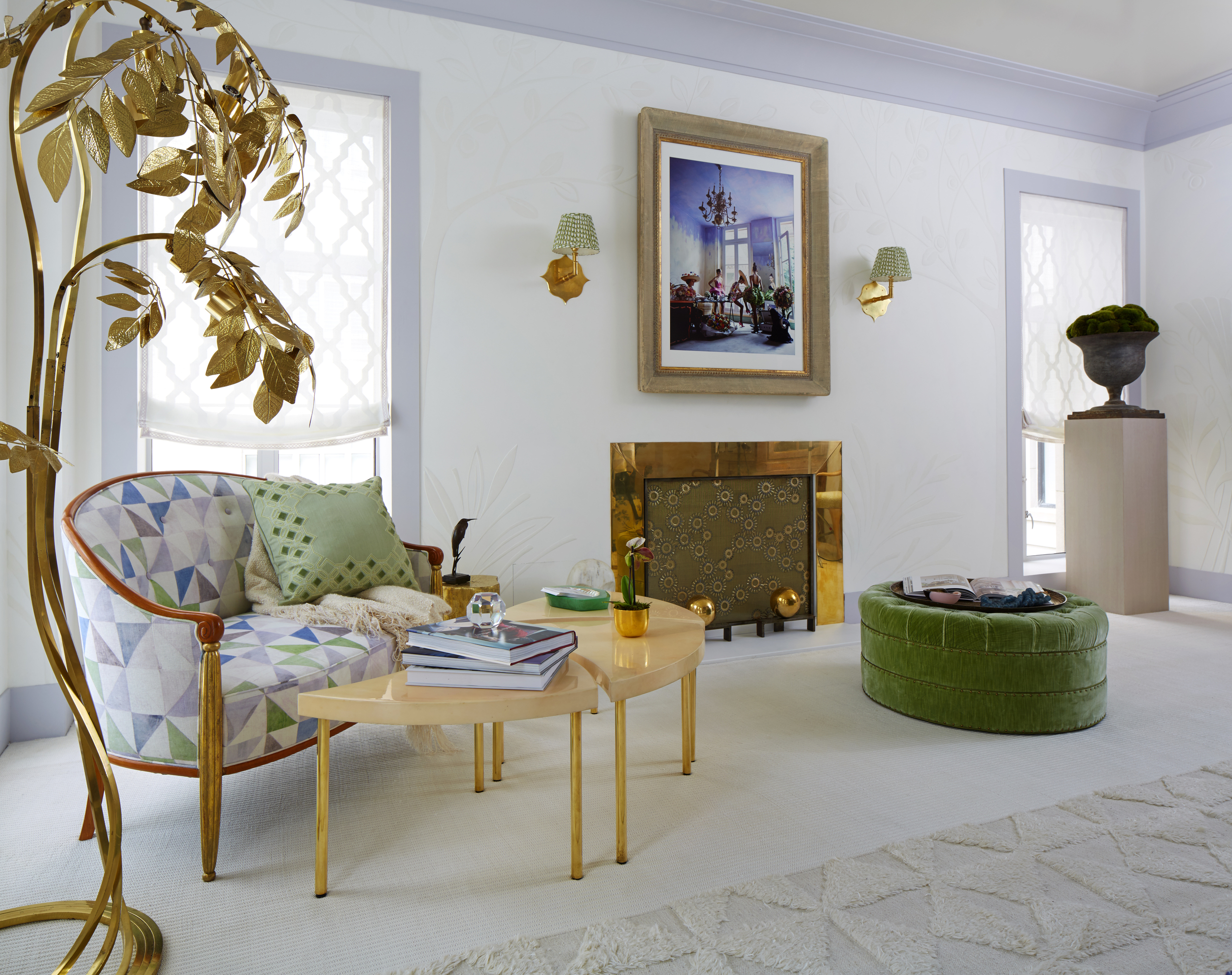
Is this what heaven looks like? I think it is. Timothy Whealon created a serene bedroom in a cream palette with touches of lavender. His work is the epitome of understated elegance.
A look at the fireplace wall, with charming Soane sconces, touches of brass, gold and pops of green. Every special antique and object is given room to shine, and looks compelling together.
David Kleinberg, who recently restructured his design firm making principal designers partners, did a sitting room with luxe lacquer walls and architectural details that wowed.
Using just one intricate pattern, a cozy reading chair and ottoman provide a nice spot to relax. As always, the design team has considered how people will really live in the room, providing a spot to put a drink and good light for reading. The tray ceiling glowed with an illuminated layer, creating a halo effect.
Catherine Olasky and Max Sinsteden of Olasky and Sinsteden understand the power of charm. In their bedroom, twin beds with scalloped canopies are fully upholstered, and a floaty Claremont print in a soft green swathes the walls creating a soothing enclave. Ever the classicists that reference the past for today, the room is filled with beautiful antiques, including the tiniest slipper chair in a floral chintz, and pretty decorative details with unique contemporary art.
To hide an air conditioning vent, they filled a vase with flowering branches. Nice trick!
To think of installing a terrazzo floor in a showhouse is a bold move. Designers have just six weeks to install their rooms. The time and expense was worth it, as these floors are just amazing. Sawyer Berson, inspired by Italian 1940's and the garden room at Villa Necchi, they matched the floor of their petit salon to their color scheme of a rich dark green, and gold hues, with Venetian plaster walls were done in a deep green. Furiture had clean lines and crisp details, making this space feel very modern and now. Does this signal a return of bullion fringe? Perhaps.


