MARK D. SIKES HOME COLLECTIONS EXPLORE CLASSIC AMERICAN DECORATING
Images courtesy of Mark D. Sikes
In 2016, designer Mark D. Sikes launched a fully executed vision of collections and collaborations, taking the design world by storm. Fabrics with Schumacher, furniture and accessories with Henredon, striped dhurrie rugs with Merida and a book, Beautiful: All American Decorating and Timeless Style with Rizzoli debuted in quick succession. Getting things done at this pace requires focus, determination and organization, something this interior designer has in spades. Coming off a whirlwind book tour, he is maintaining a busy calendar this spring, and is the honorary chair of the 17th Biennial Lake Forest Showhouse and Gardens April 30th.
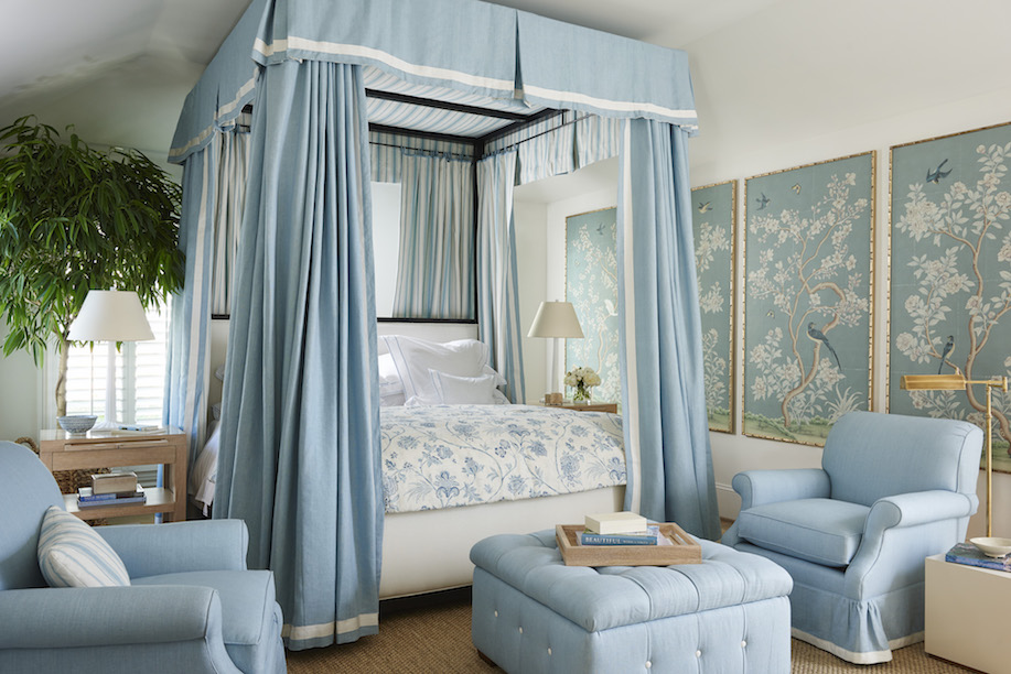
Working in a California classic style, the confluence of collection launches allows designers to use his pieces and collections together, putting their own spin on his traditional classics. As a big proponent of blue and white and interiors that reflect the crisp, tailored side of indoor outdoor California living, his perspective is inspired by great design of the past, and he cites Mark Hampton as being particularly influential in his look. Ahead, I talk to Mark about his creative vision, the design process, and his interiors.
You've launched a book, fabric line, furniture and accessories collection, and rug collection within a six month span. That has never really been done before. How did you accomplish that, and what was your vision?
We worked on everything a long time beforehand and it just so happened that all the introductions fell on the calendar within a six-month time span. Some collections got pushed back and the end result was the busiest couple of months of my life. My hope was that each of the collections play into the story of all-American decorating and that the book could bring it all together for everyone.
What are you most proud of, and want people to know about your product ranges?
I’m really proud of the quality of each of the collections we produced. Working with Schumacher, Henredon, and Merida (and Soane beforehand) was a privilege because each company upholds such high standards. I am also proud that in designing the collections, I stayed true to myself and that these introductions reflect who I am, my style, and the things I love.
What is one of the biggest challenges you faced when designing each collection- from textiles to tables? Each medium has its nuances. What was the most important thing to get across and accomplish? How do you want people to use your designs? And what do you feel sets them apart in the marketplace, is it price, a point of view, materiality, scale?
For me the process always starts with conceptual designs. I always start with mood boards that might include people, places, and things just like the content on my blog. Then you go through sampling to get the colors and scale just right. The sampling process is complete tedium, but it was also fulfilling in the end.
What were your main objectives with Schumacher and what was it like to work with Dara, their creative director?
Dara is someone I respect greatly in this industry. It was an honor to work with her. I wanted to create something I as a decorator would use. I also wanted each fabric to be able to stand alone, yet as a whole, I hoped the collection would sit beautifully together.
Your Henredon collection included classic pieces in light finishes, some darker woods and slipcovered pieces. What makes them feel most California to you? How did you determine what the core of the collection would be? What are the best sellers so far? What is your favorite design?
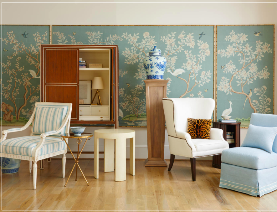
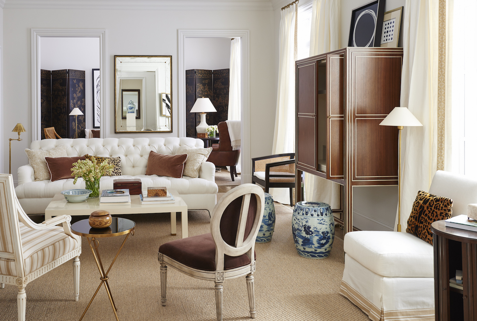
For me, what makes the collection Californian is the eclecticism. It’s Asian, French, and American. I also think the mix of materials makes it feel more California, especially the cane and the rush pieces. So far, the best sellers are the chinoiserie armoire and the chairs.
What were you really passionate about that you had to fight for when it came time to edit down?
In terms of pieces, I had to fight for the pedestals, and the slipper chairs. In terms of concepts, I really pushed for the marketing idea that the collection would have four distinct locations or lifestyle stories. I came from a retail and merchandising background so this was very important to me.
How did you ensure your point of view was cohesive and hung together when creating products for different categories?
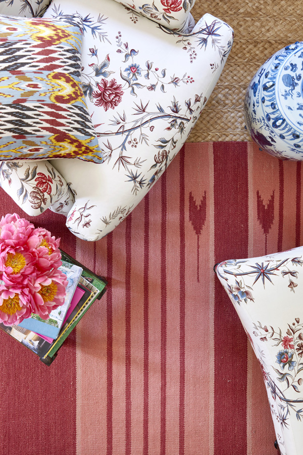
If you look at the Henredon catalog, we used all the collections together: Merida rugs on the floor, and Schumacher fabrics on the furniture. It all works together. These are all things I love and use in my work, so I think they coexist quite nicely.
What were and what became your favorite materials to work with?
The Merida dhurrie rug process was fascinating to me. Specifically, in sampling you realize that hand weaving the yarns creates distinct color variations that can have big impacts. This gave me a new appreciation for rug making.
Your accessories, from mirrors to trays and boxes are rooted in the classics but have a clean modernism to them. What inspired them and what did you feel was missing in the market? How did you decide what finishes and materials to use?
For the accessories, I wanted to make necessary functional things that were also interesting. For materials, I wanted there to be a juxtaposition between the traditional materials and the more modern materials.
You love stripes, blue and white, and also using red. What designers of the past and present most influence your work?
Mark Hampton is at the top of my list, but the list also includes Bill Blass, Oscar De La Renta, Stephen Sills, Bunny Williams, and Givenchy. Making this list, I realize many of them represent an intersection in fashion and interiors. I think that is what really inspires me.
How has your approach to designing homes and working with clients changed since you designed your own collections?
My approach hasn’t changed and my process is very much the same. Of course, I do use some of my own products in my work now.
Many designers start with the rug when designing a room. Your Merida collection is based on a traditional cotton dhurrie, with amped up wider stripes and a clean color palette of red, blue and brown. How did you decide what approach to take with those designs?
When designing the dhurrie collection I wanted to use patterns that were authentic to the practice and tradition of making dhurrie rugs. I also paid special attention to the weight of the rugs, so that they were on the thicker side.
How do you want designers to use and live with your pieces?
I hope the products will stand the test of time. I wanted to create things that can be layered into designers or consumers’ homes alike. I’m looking forward to seeing how other designers use these pieces as I’m endlessly inspired by their interpretations and designs.
What is next for you when it comes to creating decorative products?
I can’t say just yet, but stay tuned!
--


