MY FAVORITE ROOMS: 2023 KIPS BAY PALM BEACH DECORATOR SHOWHOUSE
The design community is once again making its annual winter pilgrimage to Palm Beach to visit the Kips Bay Decorator Showhouse. Celebrating the sixth year in this resort locale, the showhouse supports both chapters of this important charity and has attracted a huge following that has grown steadily and now gets over 10,000 visitors that walk through. Luckily, they secured a Mediterranean villa located right on the intercoastal, and it is a wonder they could find a location at all given the white hot real estate market. As usual, the 21 participating designers brought their A-game, and the varied spaces are filled with design inspiration, from fabulous color to custom finishes. There were many trends worth noting, including references to Old Florida, tons of natural materials, elaborate canopy beds, tonal hues, palette cleansing color schemes, maximalist style, and large rooms were made to feel intimate with various seating areas that created a cohesive look and feel. And that’s just a few of the moments that stood out. Ahead, a few of the rooms that felt fresh and exciting, and made me take notice.
Credit: Nickolas Sargent
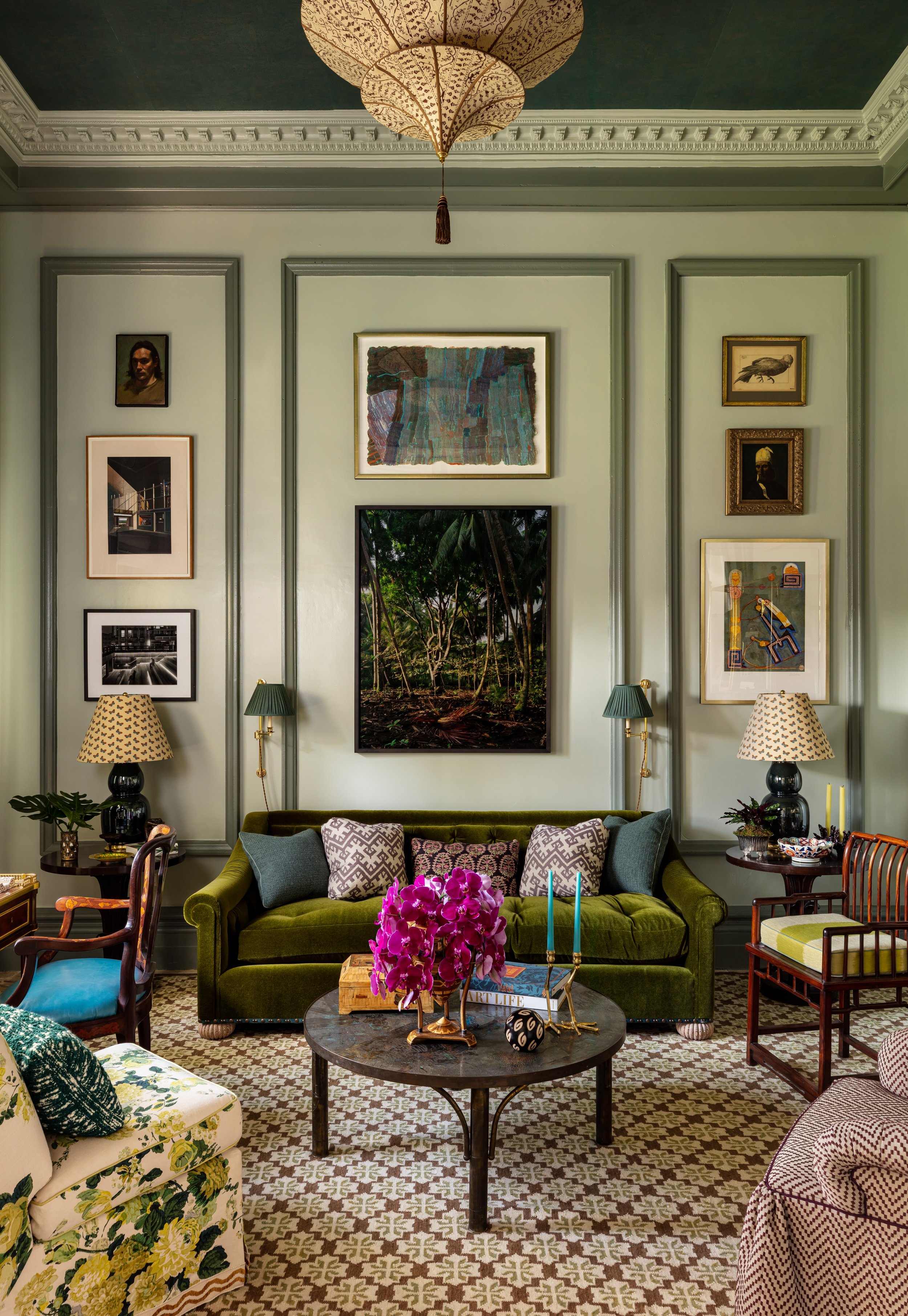
THIS lambrequin. Jaw-dropping. Inspired by a 16th-century Indian palace, the shapely silhouette draws the eye to the garden beyond.Bringing the classic, elegant, and new traditional to Palm Beach, Lucy Doswell hit all the high notes with “The Study.” Layered with jewel tones and a bit of chintz (a slipper chair’s worth), her study is an updated take on English country house meets Florida. Fun fact: the Laverne coffee table inspired the design scheme and belongs to her grandmother.
The always clever Amanda Lindroth designed a spot to linger and lounge, and stare out at the blue waters of the Intercoastal. In her “Great Room” she created two distinct seating areas, dividing the vast space with back-to-back white sofas. It feels intimate despite high ceilings. Incorporating wicker, rattan, and statement antiques, along with wonderful classic decorative touches, including a knockout faux finish tortoise mantle and hand painted walls, the space is elevated and elegant without being stuffy or fussy. A teal and white color palette ties the room together, evoking Villa Brandolini’s Winter Loggia in the Veneto that inspired the scheme.
Swellegant, shellegant. Every room should have a cabinet of curiosities, filled with coral and shells.
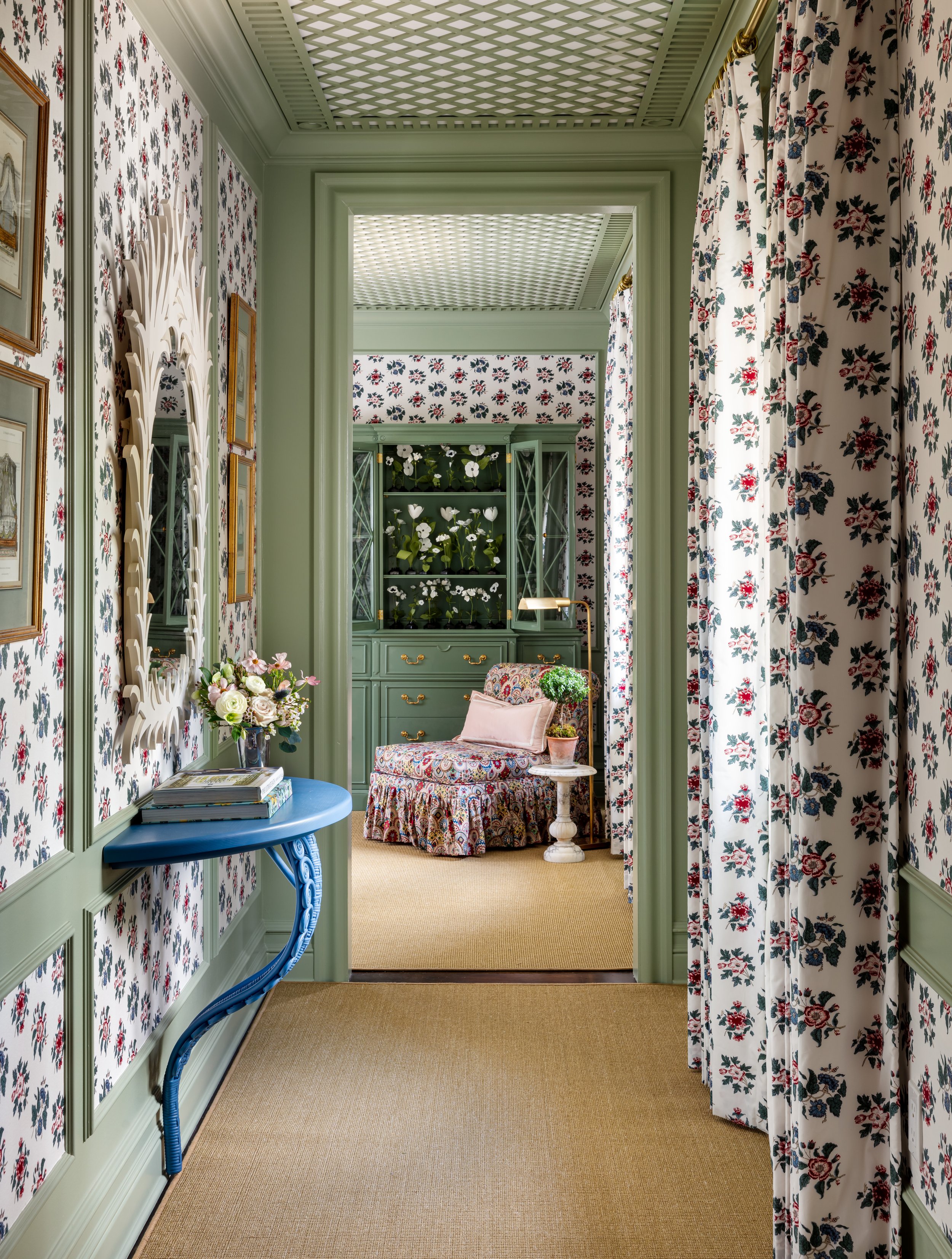
Pink and green is and has always been the color palette of Palm Beach. Swathed in a rose floral print from Soane and lovely green lattice, this “Primrose Park” guest bedroom designed by Amy Studebaker is the stuff dreams are made of. Pastel accents add a feminine air, and the rose floral print on the walls creates an expansive woke-up-in-a-garden feeling. The canopy bed is the star of the show, and has panels made in a narrow stripe.
An undulating wicker console infuses the seating area with a lighter material that gives a sense of place.
With a penchant for fabulous and unexpected color pairings, Katie Ridder designed her “Garden Bedroom” with pops of bright yellow, grass green and bold blue. Katie is a gardener extraordinaire, and she brought the lush tropical landscape indoors, along with the signature custom details she does so well. Fun fact: Katie’s husband and partner Peter Pennoyer designed a room at last year’s show house, and this design duo creates stunning spaces with an appreciation for vivid color and classicism.
The seating area plays to the old school side of Palm Beach, with whimsical wicker and rattan covered in jubilant prints. I asked Katie to share her favorite moment or object in her space and she said, “my favorite part is the bed: the custom Leontine bedding, the quilting by Penn & Fletcher on the headboard, the Alice Sergeant fabric on the boxspring and the Kathryn Ireland fabric for the bed hangings – everything came together seamlessly and I really love how beautiful this bed is.”
The natural world provides endless inspiration in Danielle Rollins’ space. Lending a more relaxed feel, neutral rattan, wicker, sisal and raffia provide texture and contrast, and inject spaces with a lightness. Palm Beach resident and Kips Bay Palm Beach alum designed her “Cocoa Lounge” in homage to Angelo Donghia. She filled her airy room with tailored pieces that channel a toned down tropical 70’s and 80’s style in a muted, natural palette.
The vintage Donghia armoire turned bar is the star, and why shouldn’t it be? It’s five o’clock somewhere!
David Frasier’s “Acanthus Enfilade” spanned three rooms. His updated take on the classics incorporated tailored details and pretty moments. If you were wondering if chocolate brown is making a comeback, here’s your answer.
David shared the best part of doing this show house: “The beauty and inspiration of being in Palm Beach for an extended period of time has been magical, but the best takeaway from the show house has been the friendships formed with other participating designers.”
Peach is a color that reminds me of traditional Palm Beach rooms, so naturally I was glad to see Lindley Arthur use the sorbet hue, along with brackets in “Pristine Providence.” Call it an updated 80’s vibe. I asked her to share her favorite part of her design and she elaborated, “The hand painted Gracie wallpaper was the very first element we chose, and it has remained my favorite element of our design. I love the peach ground, and the silhouette bamboo design is soft and even a little contemporary. I also love the antique objects we mixed in, especially the collection of 19th Century tortoiseshell boxes. “
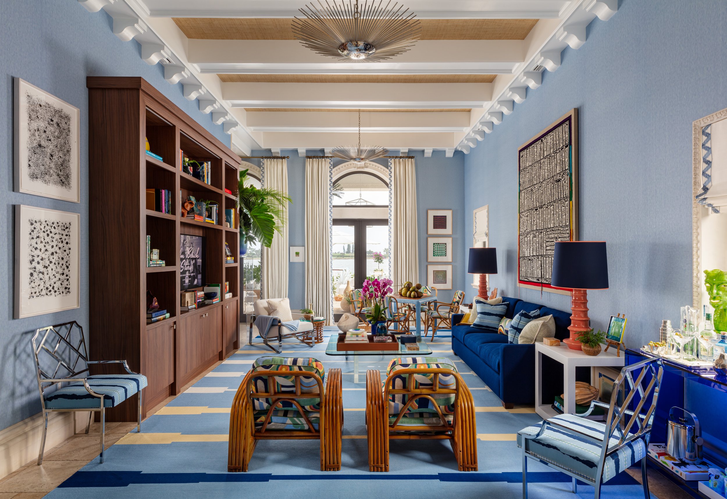
Scott Sanders has a way with blue and white. It’s a color pairing he has used many times, and each time it looks fresh and new. He made this enormous room look cohesive, and I was thrilled to see he included a game table in “Palm Beach Modern” since Backgammon is a beloved pasttime in this resort town.
Turning the expected on its head, Billy Ceglia used an all-white and natural color palette in his outdoor oasis, “Le Palmier Blanc.” This isn’t Billy’s first rodeo, as this is the second time he’s designed a space at Kips Bay Palm Beach. For his outdoor enclave under a sheltering loggia, he paired lattice and bamboo, in a mix of crisp and classic elements that co-mingle in this monochromatic outdoor room. A rush rug grounds the space, adding a natural element that makes the area feel like an open air living room and is the perfect spot to sit and enjoy the breezes from Lake Worth.
Honey Collins she mixed vintage pieces with modern prints and patterns in “A Room With a View.” She shared the unique challenge that came with the space, saying “the trickiest element of our space was the awning. When we started this process, the balcony was completely exposed to the elements, and we knew we wanted to make this area feel like a real extension of the home. We created the design and worked with a great local company to bring the vision to life. The awning has transformed the space and allowed the different entertaining areas to be functional and enjoyable rain or shine.”


