A VISION TO BEHOLD: THE HIGH LIFE AT HEARST'S DESIGNER VISIONS SHOWHOUSE 2013
A rendering of Walker Tower in Chelsea, where the penthouse has sold for over $50 million.
Showhouses are great for many reasons. The amount of interior detail each designer puts into their space can be incredible, from the wall treatments to upholstery. This fall, Hearst invited 3 interior designers to partner with their shelter publications and transform spaces in the Walker Tower, a renovated uber luxe Chelsea building at 212 West 18th Street recently turned condo. It used to be where Verizon was based. In case you were wondering, most of the 55 apartments have sold, for jaw dropping numbers. But that is the state of New York City real estate, it is filled with transactions commanding staggering figures. One of the prime assets of this tower is the sweeping views that can be seen from the massive, floor-to-ceiling paned widows. Even the bathrooms have them. Here is a look at the details that made the apartments, created for fictitious characters who live there, as designed by Alessandra Branca for Elle Decor, Jamie Drake for House Beautiful and as chosen by Veranda, Carlos Aparicio. There are many design lessons and inspiration to be found, take a peek at the interiors.
The grand duplex apartment, designed by Alessandra Branca, was filled with color. Her inspirational occupants were based on an Uptown family with a flair for downtown living and an art-collecting sensibility.
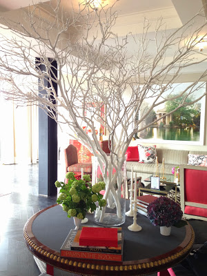
The open plan living room with large windows gets a lot of light, so Branca painted the herringbone wood floors ebony. To accommodate groups, a banquet lined one wall and stools were placed around an antique Center Table from Gerald Bland stacked with books and flowers.
Mixing a zebra rug, a greige velvet on the banquet, paisley on a slipper chair as well as her new Schumacher Chintz fabrics, Branca played with pattern. Pairing antiques and modern forms, she fuses old and new together with aplomb.
A stately white Peacock holds court in the corner between floor to ceiling windows draped in cream fabric.
An 1870's Louis XVI antique demilune from Atelier Branca with a rock crystal lamp from Liz O'Brien and a floral painting sit between two windows. Beside it, an antique klismos chair covered in hand marbleized leather.
The polished yet comfortable kitchen dining area was recently featured on the cover of the December issue of Elle Decor. With a cream and caramel color palette, the custom arched lacquer dining table has a marbleized paper funnel shade above it for a sense of drama, and is surrounded by Louis chairs, mixing old and new.
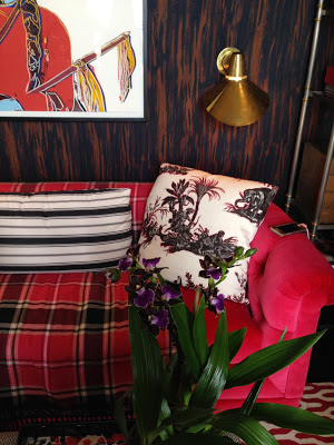
A study features red, white and black with a red velvet sofa flanked by brass etageres and a mesmerizing Candida Hoffer photograph. Touches of her red plaid for Schumacher balance out the red and white zig zag pattern on the Rug Company rug.
Walls were upholsted in a faux bois print, which added a country feel to the relaxed, pattern-filled library.
Not one to shy away from color, she designed a guest bedroom in bright red and navy with elaborate window treatments in a bold print with pomegranates she designed for Schumacher. A striped lampshade, a diamond patterned rug and damask fabric are tied together by solid colored upholstery.
Another angle of the room, with a cozy sofa dressed up with bullion fringe. More contemporary modern art ties in with the palette.
No detail is overlooked from the bolster pillow to custom red lampshades that match the custom cut corner headboard that incorporates the signature fabrics in the room.
The master bedroom is a riot of citrus. Tempered with gray velvet and wool upholstery and a pop of persimmon with a Sferra throw, walls are covered in her classical yet oversized Schumacher damask pattern. To ground the room, an ebony Michael Taylor Kempner Canopy bed is the star. I love that there is a place to sit with a Jansen style settee at the foot of the bed.
A small arrangement of roses in a bisque bois vase is such a charming touch.
Floor length curtain panels and walls covered in the same fabric have an enveloping effect.
Upstairs, in a bedroom fit for a girly girl with Champagne taste, pink and grey hold court. The sweet canopy bed gets a dose of global chic with a paisley coverlet.
Jamie Drake’s muse, the granddaughter entertainer, Josephine Baker, worked in fashion and entertained a lot, but also needed space for her stylish daughter. The living room has a palette of peach and grey, with the walls finished in Benjamin Moore's Salmon Peach and Jim Thompson's New Silk Twill at the windows in dramatic panels. The Edward Ferrell Lewis Mittman Paramount sofa is covered in Onyx by Glant, and the Trenton armchair chair beside it is covered in Donghia's Sabrina in Rose. Touches of metallics are everywhere, from the lamps to the accessories on the curvy modern coffee tables. Drake has lightened the herringbone wood floors to work with the deco palette.
A better look at the darkened bronze, amoeba-shaped Nenuphar Table by Hubert le Gall from 21st21st. A touch of brass comes from an Arteriors footed bowl.
A charming moment of miniatures, with a Hutton Home Bon Vivant Chair Covered in Pierre Frey's black and white dotted Moire Princesse II in Sanguine.
In the dining area, you can see the third color of the palette, a fresh light green. Art Deco chairs surround a round granite and bronze dining table from modern designers, Egg Collective.
In a clever storage move, rather than surround the fireplace shelves with logs, assorted books with some showing spines to reveal their titles.
Is the round rug making a comeback? After seeing them at Kips Bay and here, I can say yes, it is. In the media room, a modern daybed from Donghia is covered in a dark Rubelli solid and the pattern is included with contrasting, textural throw pillows and a Donghia screen creates an enveloping nook in the corner. For a touch more glam, he included Flair's Heron Brass Floor Lamps.
A sunny yellow headboard covered in a Boussac fabric sits dramatically in front of custom plum colored Venetian plaster walls done by Alpha Workshops in the daughter's bedroom. Pops of turquoise, in a glass lamp, Pratesi linens and pillows play well against the Fort Street Studio patterned rug.
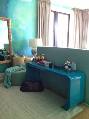
Resembling clouds or an underwater world, walls are covered in a custom Watercolor Wallpaper design from one of my favorite companies, Black Crow Studios. A teal lacquer waterfall console from Rearview Modern creates a division between bed and closet area. The bed headboard faces the windows.
More shiny pretty objects next to flowers. A luxe Nest shagreen-inlaid box and a gold ceramic vase.
To the left of the bed a David Duncan white dresser holds a tv and mother of pearl lamp from Lorin Marsh. Don't you feel like you are on a remote island living inside a lagoon?
Robert Kuo makes beautiful, pure colored Peking glass vases, which Drake has filled with bold blue Hydrangeas.
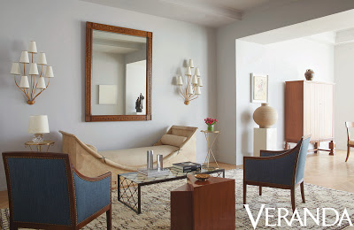
As a renowned 20th Century antiques dealer with his Gallery BAC, as well as full-service architect, Carlos Aparicio filled his apartment with handsome and rare pieces for his muse, a gentleman collector. Focusing on grey and the many variations of the color, the walls in the living room shown above set the backdrop for the textural objects and many hued woods featured within the space. As a collector of French and Swedish 30's and 40's, the muse would move pieces around constantly, so Aparicio, with his impeccable eye, created a neutral canvas from which the cast of characters could rotate. His attention to the purity of forms is what is so captivating. A parchment Andre Arbus daybed resembling a boat serves as the focal point in a seating area featuring furniture with clean lines. My favorite thing here? The tiered Royere sconces that add a softness from Gallery BAC.
In the serene dining area, a 1940's Danish Dining table splits to becomes demilunes. Around it, simply elegant Beech wood Jean-Michel Frank Klismos chairs. A 1910's Swedish linen-shaded crystal light fixture hangs above.
The dining table is styled with design books and a Stoneware vase of cream Hydrangeas.
In the master bedroom, a low Jules Leleu bed has an almost monastic presence, and each piece in the bedroom, including this console and perfectly scaled small shagreen lamp have presence.
A sole Line Vautrin Sunburst mirror adds a precious moment.
Intricate in it's carved facade, a Swedish Mahogany dresser from the 1940's in the Northern Baroque style, with diamond shaped lozenge carved detailing.
A really interesting Danish "Neo-Antique" chair based on a Roman original with wooden dots applied to it and original horsehair upholstery sits beside the statement dresser.
In the study, Aparicio created a strict space-- spare and hotel-like in its serenity. A few well-chosen pieces, like the French 1950's iron and wicker daybed and iron and leather Frank-style chairs act as the neutral foil to the graphic abstract black, white and grey Cindi Johnson oil painting that mirrors the 20th Century Swedish rug in the same tones. The Doctor will see you now.
A better look at the wall/floor relationship.
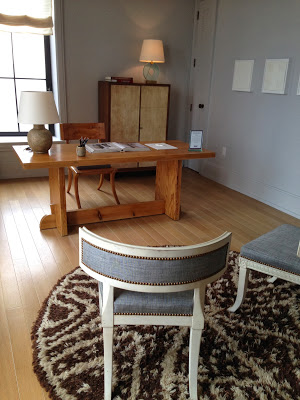
Letting the clean forms of the antique pieces make an impact, the spare office space is quiet and contemplative. The lesson here is in wood and material combining-- don't be afraid to mix Pine, painted wood and parchment as he does here. A round rug (another!), in brown and cream adds a dose of color and pattern to the soft blue and gray tones in the room.

