TALKING TRADE SECRETS WITH JASON OLIVER NIXON AND JOHN LOECKE
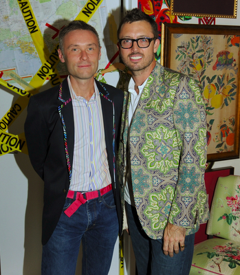 Mad. Electric. Fabulous. A brilliant riot of wild color and neo - preppy pattern. Just a few words to describe Jason Oliver Nixon and John Loecke's design style. They push the envelope, since hey, you never know where it will take you. They call their style by the F word: "Frisky, fabulous and fun to be around". Not only does Jason act as the Global Lifestyle Editor for Delta Sky Magazine, he is a design partner with John in the design firm, John Loecke Inc., and runs all over town seeking out finds, new and those needing a revival. Whether they are redoing their Brooklyn apartment or creating a showhouse room the element of surprise in their work will always make you happy, and feel better after having seen their creations. Their show, Small Space, Big Style on HGTV brings it all to life, and you will adore them as much as I do after getting a glimpse at how talented they are. I recently sat down with them to find out what makes them tick.
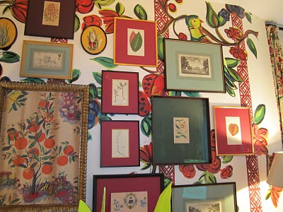 For the Showtime Showhouse recently, they were asked to take on the show Weeds, and they created a "Paradise Lost" den like you have never seen before. Prints hung salon style make the wall a fascinating gallery of color and texture.
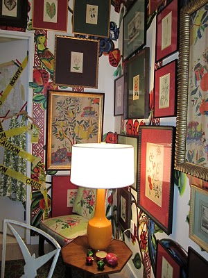 More art! Floor to ceiling artwork in frames from J. Pocker mean you always have something to look at. With the help of the picture hanging geniuses at ILevel, creating this look in your home is totally doable.
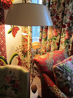 A riot of floral make for a mad preppy mix-- Diana Vreeland's Billy Baldwin-designed red lair meets Sister Parish with Cowtan and Tout prints.
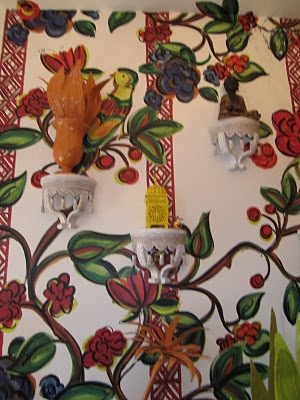 Charming white brackets by Carleton Varney for HSN hold colorful decorative objects in bold colors picked up from the wallpaper, a killer new product from sponsor HP called Wallskins. John painted the design, uploaded it, and printed it out. Not bad, huh? If you are crafty, this program could be your new obsession.
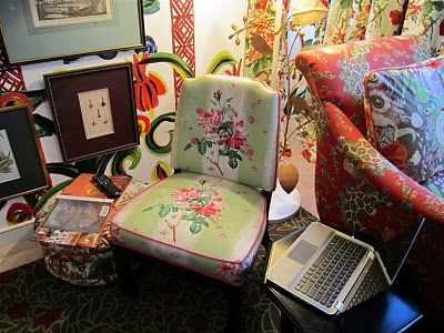 Chintz and florals of every scale mix and mingle in the garden of Eden setting, bringing this verdant combination into this day and age. It works because it takes whimsy just far enough.
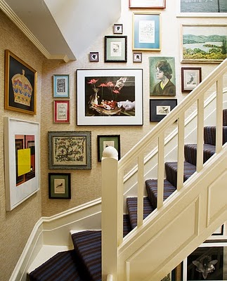 In their Brooklyn home, the same aesthetic applies. More is more, and fear of color is banished.
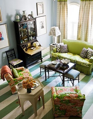 A fab mix of stripes, florals and quirky repainted antiques just works.
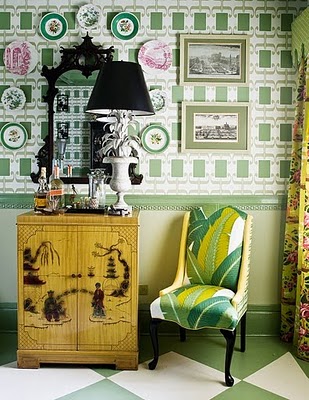 The fun house fantasy exists in all corners of their home. Plates are arranged against a mod paper, a tole aloe lamp sits next to a bar set up, and a palm frond print is upholstered on a classic chair.
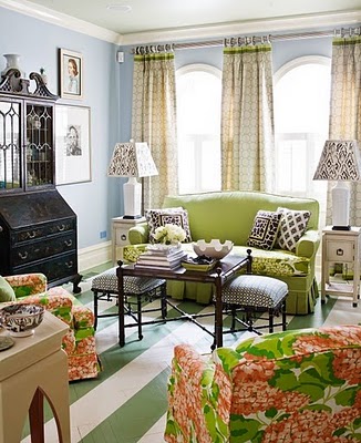 Shades of green play through the space and a pale blue wall acts as a grounding neutral.
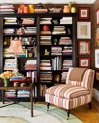 Mix masters who know how display is everything, these guys have more books than they know what to do with. The thing is, they probably use them all the time for reference, so they need to be easy to get at.
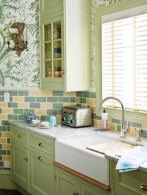 Who would have thought pairing colored tile and chinoiserie paper would work? With their deft touch it does.
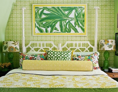 A sunny bedroom of green and yellow combines thrifty finds and Schumacher fabrics.
 Photos courtesy of Jason Oliver Nixon and John Loecke
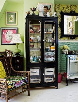
A dark piece of furniture grounds a room with this much color, pattern and mirror. the wallpaper obsessed duo clearly cannot get enough pattern play. Putting art in unexpected places adds an artistic element where you never you needed it.
What is the best way to live with color?
We are passionate about color and love to be surrounded by multiple patterns and textures. It works because we keep everything in the same tonal range, and that brings consistency throughout a space. We love pushing boundaries and think of floors and ceilings as blank canvases, just as we do the walls. Often, we will paint a floor in a jaunty striped pattern and wallpaper a ceiling. We say, embrace color and have fun. Beige is so boring. Your home should make you break out in a smile every time you open the front door.
How do you ease clients into working with bright colors?
We like to challenge our clients to expand their horizons through color. We map out each space before we begin and walk them through the paces of mixing colors. We are currently working on a SoHo loft that has all-white walls, but we have added splashes of color through Gracie wallpaper in bright orange on the wall wrapping the fireplace and through amazing, color-packed artwork that runs from floor to ceiling. And then the dining chairs are done up in pink and yellow patent leather and the ottoman is a crazy Osborne & Little floral. In this case, white is the unifying color.
What is your favorite color combination now?
Anything in a jewel tone sends us over the moon. And we love blood red and blue. It's all about India and the Far East.
Stylistically, what moment are you loving now?
We are having a "Garden in Hell" moment, a very Diana Vreeland red lacquer fantasy. We are all about Cherries in the Snow and Chanel adverts from the 1970s. Red or dead, we say.
You love decorative accessories as much as I do. What can accessories do for a room?
Doing up a room is like pulling together a great outfit. We take a room and give it terrific bones then add some Auntie Mame-styled charm bracelets dripping with buddhas and jangles and then throw on some Chanel chains and some YSL over - sized cuffs and some great, inexpensive pieces from Forever 21 and H&M and, voila!, the room's a stunner. Details make all the difference!
What is your favorite material?
Wallpaper. We've never met a room done up in Gracie or De Gournay that we didn't love.
Have any great tips on making bookshelves look well styled?
Mix, mix, mix, and throw in plenty of organic and antique elements. We love pieces of wood, urns, vintage magazines, and curated collections. We are currently obsessed with vintage toy garden panoramas from England and have the various scenes arranged in Lucite boxes.
Where do you go for inspiration?
The Isabella Stewart Gardner Museum, Kykuit, Olana, the Leighton House Museum and Victoria & Albert in London, the markets of Cairo, Istanbul and Jaipur, the canals of Venice, and The Greenbrier in West Virginia. Basically, we can find inspiration anywhere.