KIPS BAY PART II
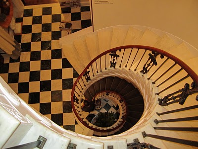 Taking it from the top! Ascending the spiral staircase, I continue my coverage of this year's Kips Bay Designer Showhouse. It closes tomorrow, so the time to see it is nigh!
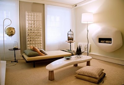 Cool sister act Jayne and Joan Michaels of 2 Michaels added warm minimalist modern design and a bit of edge to this year's lineup. Organic shapes, neutral tones and mixed materials made their room extremely exciting. The hearth has a space age yet Flinstone quality to it-- a work of art in itself.
 Their meditation room was made up of carefully selected objects that added layers of meaning to the space.
 Photos by Brian Fender
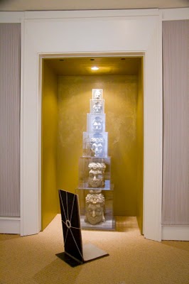
The stack of buddha heads made out of recycled telephone books from artist Long-Bin Chen adds urban zen. The meditation chair is at the ready for those that want to escape the madness of city life.
 On the 5th floor landing, Nancy Boszhart created relaxing yet formal space, covering the walls with faux shagreen embossed wood cut outs. The results are stunning-- a true installation feat! Neutral cream colors and lush dark woods work together to create tonality.
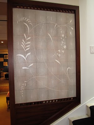 By the staircase, the inlay work mastery continues with a floral detail.
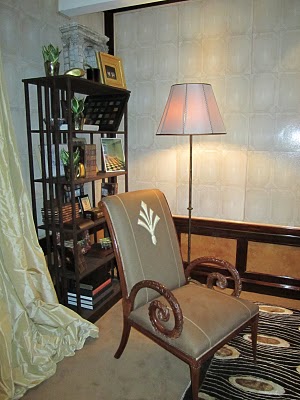 A pair of elegant armchairs with custom embroidered upholstery frame the sitting area on the landing. Billowing silk curtains enclose the space.
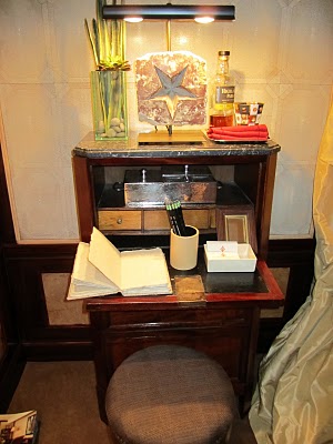 A diminutive secretary for writing notes and journal entries was charming.
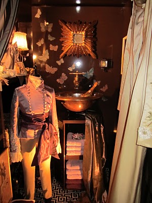 In collaboration with the glamorous clothing designer Maggie Norris, Aman and Carson created a tiny powder room, with chocolate lacquer walls, butterflies and a miniature sink.
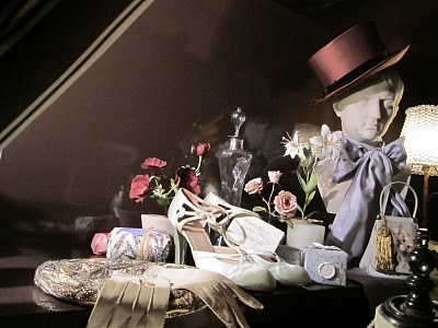 Maggie Norris Couture at work...
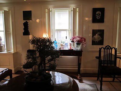 The powder room was to the left of their main room, the Art Collector's Salon theme. The entryway was a chocolate lacquer box so shiny you just had to touch the walls.
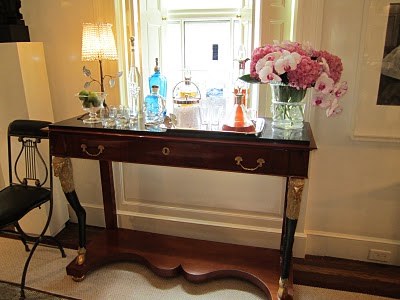 Drinks at the ready on a beautiful piece by the window.
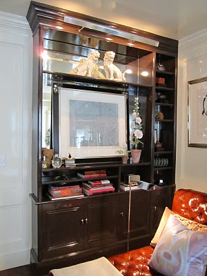 By backing the bookcases in mirror, the reflective surfaces enhance the artwork and books, making the space seem larger.
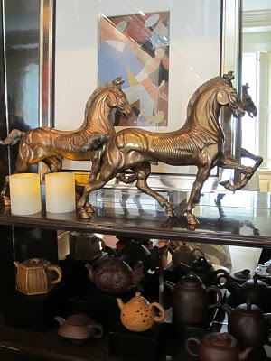 Collections abound. Note: this is how to display collections well, not in glass vitrines (!).
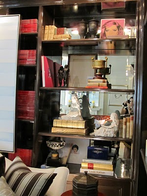 More of the mix-- books, sculpture and artwork mingle in a well displayed narrow bookcase.
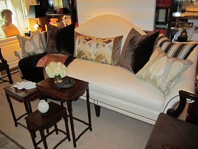 A comfortable sofa with loads of textured pillows and small nesting tables.
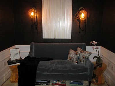 On the 4th floor landing, Robert Verdi and Deirdre D'Elia created The Hideaway, a moody space with dark velvet upholstery and globe sconces flanking a white modern art canvas.
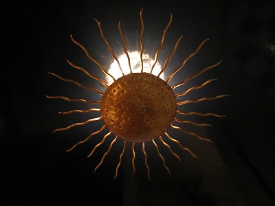 A gilded sunburst fixture looks great against the black ceiling.
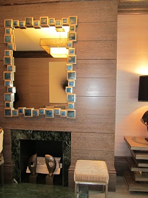 In two smaller rooms, Etienne Coffinier and Ed Ku of Coffinier Ku Design created a sitting area and bath. A zippy mirror is a singular jolt of color in the space.
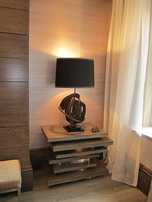 Cerused wood pieces, molding and fireplace surround warmed up the space that was filled with entirely customized pieces.
 A killer Melvin Sokolsky print from Staley - Wise dominates the room.
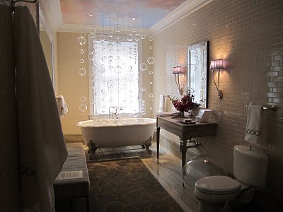 Custom glass orbs float up from the tub on narrow chains creating bubbles. This space was created by the design duo working with pre-existing bathroom framework in the house already. They added sparkle and jazz.
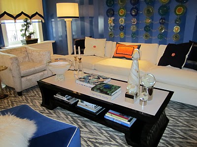 Sherril Canet created The Front Room, a grand space with a large seating plan and areas to perch. She incorporated pieces from her Stark Furniture and Rug Collections.
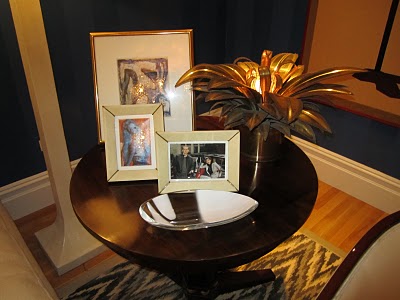 The brass plant is a fun touch.
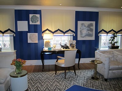 The walls are covered in an Yves Klein blue tone on tone stripe and broken up by creative roman shades.
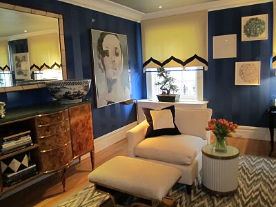 A flame stitch rug and neutral upholstery let the walls work their magic.
 A sideboard with a large mirror above is well scaled for the large space. Look out for Canet's new design book, A La Carte from Pointed Leaf Press.
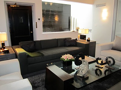 Zen out in Jennifer Post's TV Lounge and Yoga Room, with her custom pieces with Desiron and carefully placed art objects.
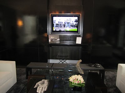 Glossy black walls and white upholstery upended the typical spa feel.
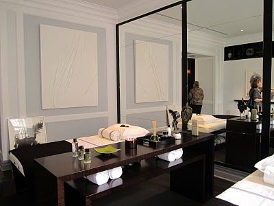 A serene modern home spa felt European with its sophisticated details, dark woods and global feel.
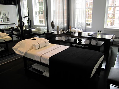 A his and hers space with massage beds and wall of mirror. Yoga mats sit nearby when relaxing leads to motion.
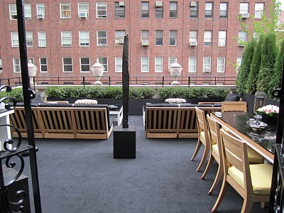 The sweeping outdoor space was really a living room out of doors with a rug, dining area and sculpture.
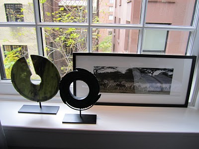 Sculptures, African art and framed photos create a gallery within a spa.